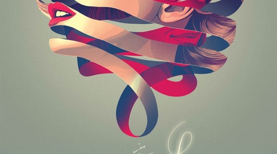
I ran across this beautiful graphic this week and loved it for several reasons. First, it’s very creative. Second, it still uses a lot of great design principles to really emphasize it’s message. I’ll point some of those out below.
Alignment
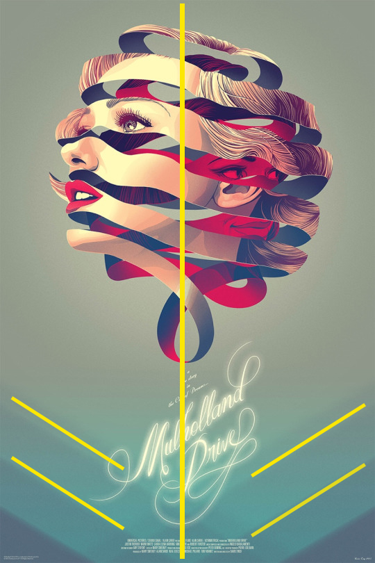
This design uses center alignment for it’s image and main title information. Unlike regular center alignment, however, it tweaks the wording so it is slightly diagonal. They do this for a number of reasons – first I think because it makes it more artistic with the center alignment with the image. Second, it aligns well with the diagonal lines that are softly shown in the background of the page.
Color Scheme
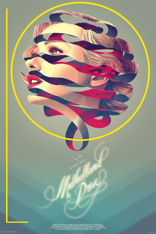
The color scheme of this design is also a fun one. They have a soft blue background that is lighter on top and has darker hues as it gets lower on the page. The main image of the design has a mix of colors, the main ones being red and blue – good contrasting color choices for warm and cool colors. This works well with the design of the image to show conflict.
Contrasting Typography

The designer of this ad chose contrasting typography. They used a very flowy script font for the title information and then used a standard san serif block font in all caps. Using contrasting typography brings in enough of a change to make the typography interesting and engaging.
Contrasting Design Element
There is a lot of contrast in this design, specifically for the main design graphic. There is the face of the woman looking out with traditional coloring of her face. You can tell that shape is a woman’s face and make out those details.
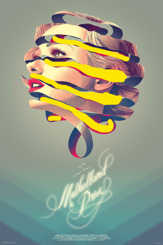
Then the contrast to that is in between the curved lines there are blue shadows and a red face. The red and blue contrast nicely with each other, as explained above. But the red color choice for the sinister face really contrasts well with the pale skin and light background as well. The pale face looks more innocent and calm, while the red face looks more mysterious and devious. I really liked the contrasting theme there as well.
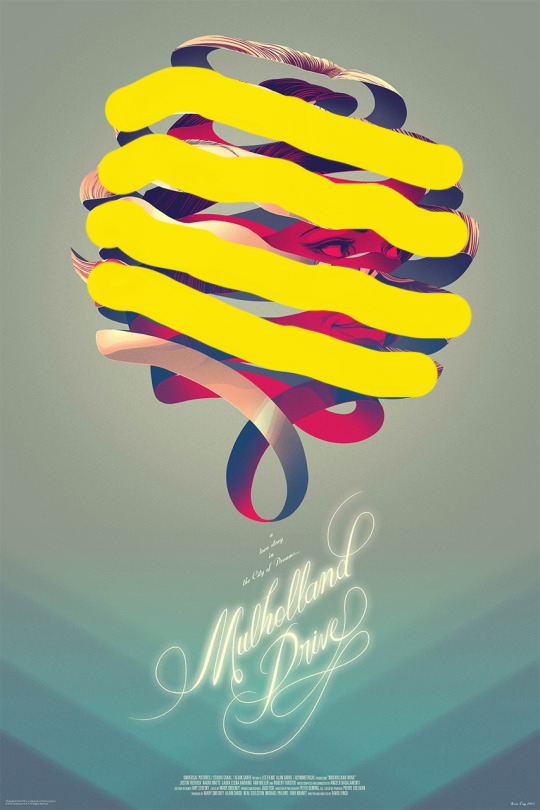
Overall the design of this graphic is really fun and interesting, with a lot of good stylistic elements to make the design stand out and look professional. Implementing these types of design principles really elevate any type of graphic. Thinking outside the box and being creative elevates it even further.
