A Trick of the Eye

KevinTong6

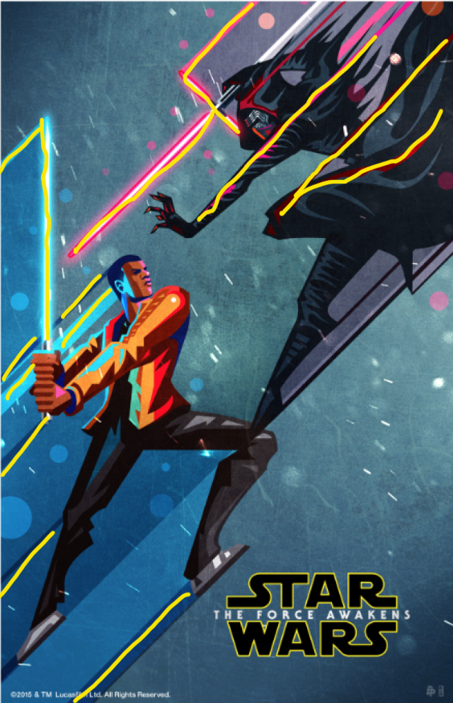
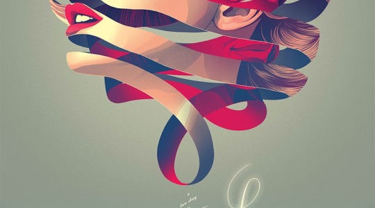
I ran across this beautiful graphic this week and loved it for several reasons. First, it’s very creative. Second, it still uses a lot of great design principles to really emphasize it’s message. I’ll point some of those out below.

Alignment

alignment

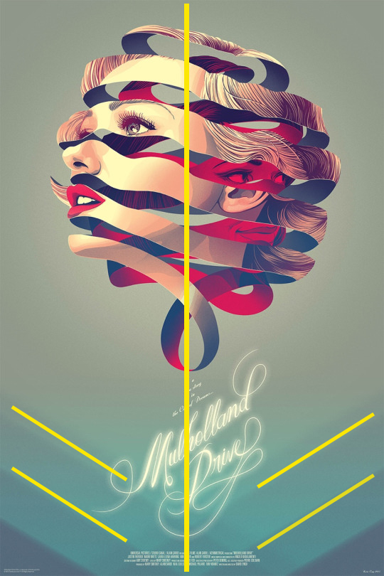
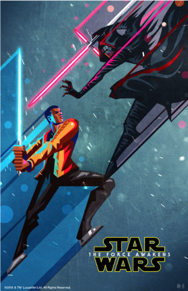
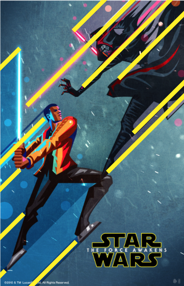
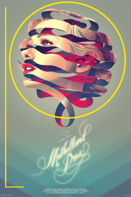
This design uses center alignment for it’s image and main title information. Unlike regular center alignment, however, it tweaks the wording so it is slightly diagonal. They do this for a number of reasons – first I think because it makes it more artistic with the center alignment with the image. Second, it aligns well with the diagonal lines that are softly shown in the background of the page.

Color Scheme

color scheme

The color scheme of this design is also a fun one. They have a soft blue background that is lighter on top and has darker hues as it gets lower on the page. The main image of the design has a mix of colors, the main ones being red and blue – good contrasting color choices for warm and cool colors. This works well with the design of the image to show conflict.

Contrasting Typography

contrasting typography

The designer of this ad chose contrasting typography. They used a very flowy script font for the title information and then used a standard san serif block font in all caps. Using contrasting typography brings in enough of a change to make the typography interesting and engaging.

Contrasting Design Element

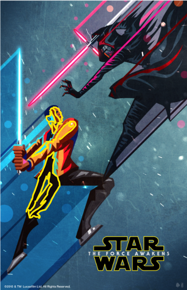
There is a lot of contrast in this design, specifically for the main design graphic. There is the face of the woman looking out with traditional coloring of her face. You can tell that shape is a woman’s face and make out those details.

face 1

Then the contrast to that is in between the curved lines there are blue shadows and a red face. The red and blue contrast nicely with each other, as explained above. But the red color choice for the sinister face really contrasts well with the pale skin and light background as well. The pale face looks more innocent and calm, while the red face looks more mysterious and devious. I really liked the contrasting theme there as well.

face2

Overall the design of this graphic is really fun and interesting, with a lot of good stylistic elements to make the design stand out and look professional. Implementing these types of design principles really elevate any type of graphic. Thinking outside the box and being creative elevates it even further.

The Key to Making a Good Icon Set

Awesome icon set example

This week I listened to an awesome interview by Kyle Adams, a famous icon designer, giving tips on why he is so successful with icon design. Some of his tips really resonated with me.

The main points I enjoyed were that before you even begin designing an icon you need to consider what the goals are behind the icons and then you need to think about who the audience is as well. Answering both of those questions will really improve the look and feel of your icons, and improve your overall design of the icons.

It was also discussed that there are a lot of established icons already and there needs to be a reason to change what is already established. A lot of times icons will be very similar, but they will have their own style on it depending on the target audience and what the goal is behind the icons. Designers can still put their own twist and style on already established icons, and get creative by setting their own set of rules to help keep the icons with continuity. These rules will vary and are established based on the goals and audience of the icon sets.

This educational icon set (below) uses already established icon designs, but uses different design principles and colors to create a new take on them.

Awesome icon set example

Contrast

Contrast is one of the strongest design principles and it is used in a lot of ways with these icons. First, there is contrast between the background shape and the light art board the icons are placed on to help emphasize the icons themselves. There is also contrast with the shadows in the the icons. The extreme light and dark portions of the design contrast well against, as well as the red and green contrasting color choices.

Repetition

Having repetitive design elements unify the overall design set. In this case, there are several repetitive elements for these icons. First, they are all placed within a circle shape. Secondly, they all have curved edges, even on the elements that are rectangular or square in shape. Another repetitive element is the distinctive diagonal shadows coming off all the icons. All of these ‘rules’ that are repeated really unify the design and help them look professional.

Color Scheme

The color scheme of these icons unify the design as well. The same few colors are repeated throughout the various icons and are another set rule this designer chose to use. The main color choices are green, blue-green, yellow, yellow-orange and red-orange. The colors are a mix between warm and cool colors, and they work well to bring in color contrast and interest. All the colors are in multiple icon selections, and the scheme really improves the unity of the design.

Having these design principles in mind can really elevate an icon set design. But more importantly, having a goal in mind when designing icons is the key to creating well designed icons that will be perfect for your client.

What Makes a Vector Illustration Look Professional?

There are some excellent vector illustrations out there, but there are major differences in novice vector graphics and professional looking vector graphics. Today, I want to point out some things that make a vector illustration look even better.

I found this beautiful artwork from artist Kaz Oomori, who partnered with Disney and Fandango to create beautiful posters for the movie Star Wars: The Force Awakens.

3_Kaz_oomori-Star_wars.png

The artwork shows numerous reasons why it works well as a vector illustration:

Leading Lines

finn leading lines.png

The illustration takes advantage of the design element of leading lines. Your eyes are naturally drawn to the image of Finn and Kylo Ren because of the use of leading lines. Not only are Finn and Kylo Ren drawn in a diagonal, action way, but the lines leading off behind them really emphasize that action. Movement, as shown above, really elevates the appearance of this poster.

Good Use of Value

finn value shadows

There is an excellent use of value to show dimension with the vector illustration in this poster. Through out the design there are examples of shadows on the two men, and also the different value shadows leading off of them. On the face alone there is several layers of different shades of color, some of them the same type of color scheme just lighter and darker, but the artist also takes advantage of the light saber color reflecting off his face as well. There is also dimension with the shading on his pants, and also on Kylo Ren’s clothing and mask as well.

Contrast

finn contrast

Contrast is prominent in this design in multiple ways. Firstly, the color scheme shows great use of contrast with the cool blue color with the hot red color. There’s also contrast with the vibrant red/pink color of Kylo’s light saber highlighting off of his dark black and grey costume. The contrast between the two characters is also noticeable here as well with Finn on the good side and Kylo Ren on the bad, so having those two perspectives is a fun play on contrast as well.

If you look at the other artwork in the series they all have these same elements with consistency and repetition between the different posters, and all of them show good use of good contrasting design principles.

1_Kaz_oomori-Star_wars kaz-oomori-star-wars.png

Having warm color verses cold colors, using a variety of shades and focusing on the value of the design, and also using diagonal action lines really helped elevate the look and appearance of these vector illustrations. I am definitely a fan.


Pedigree Ad Slideshow Project – The Final Project

The semester is coming to a close, and with it comes our final project – a Slideshow Design and Presentation. This was probably my favorite project – not just because it was the easiest for me to do but because it incorporated multiple programs. I was able to do most of my design for the slides within InDesign, and did my ad design in Photoshop. I had never placed a PSD file within InDesign before so that was fun to test out too.

Project Specifications:

For this project we were asked to find a well designed add with at least one sentence of written content on it, with a logo. Then we were asked to design a new ad in the same style as the original ad we found. They have to look the same with consistency with design, typography, layout and visuals, and needed to add the company logo. Once we finished our ad we created a presentation slide design to present to the company we chose. We needed to have 6+ consistently designed slides, we needed to talk about the design, color, and typography of the original and new ads, and we needed to keep the slides looking professional by keeping it to one idea per slide.

Target Audience Analysis:

Unlike other projects, my target audience was a specific company – in my case, the Pedegree Company. I feel specifically it would be the marketing and advertising teams of the company.

Pedigree Ad:


I looked for a well designed ad and I found this cute, creative ad by Pedigree. I talk more in the slide presentation about why it makes a good ad, but what stood out to me the most was it’s clean look and creative idea.

My Ad:

Here is my take on the ad.

I found this photo by Coffy on pixabay that showed a woman and a dog. I cropped the dog out of the photo using the content fill and clone stamp tools in photoshop, and designed the ad to look like the original ad the best of my abilities. I added the tagline and logo and

Presentation Slide Design:

I had a pretty rough version of my slideshow when I turned in my rough draft, but the more time I had to work on it the more fun I ended up having with it. I know that pedigree uses yellow so I ended up using different shades of yellow with a pretty light green as well on my slides. As you can see with the slides, I point out the different creative elements of both advertisements such as design, typography and color. On my actual slides I also made sure to be consistent with the design elements and color on them as well with the same type of shapes and angles, as well as similar typography.


Conclusion:

This was a nice project to end with. Using multiple programs for one assignment was a good review, and I feel like making a presentation slideshow is something business professionals will find themselves doing from time to time. Even online influencers who do webinars and things, this will be helpful for that as well. All-in-all a good experience.