
There are some excellent vector illustrations out there, but there are major differences in novice vector graphics and professional looking vector graphics. Today, I want to point out some things that make a vector illustration look even better.
I found this beautiful artwork from artist Kaz Oomori, who partnered with Disney and Fandango to create beautiful posters for the movie Star Wars: The Force Awakens.
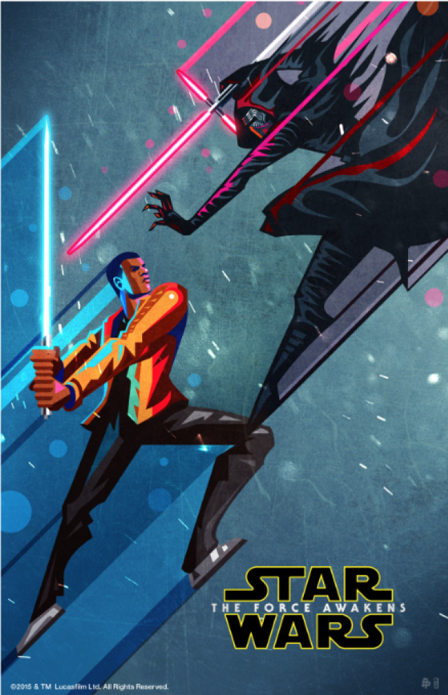
The artwork shows numerous reasons why it works well as a vector illustration:
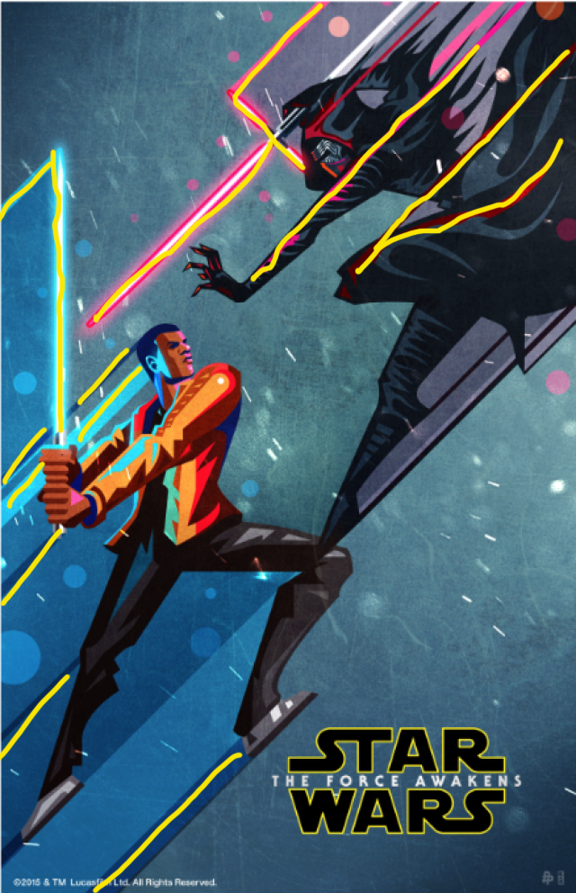
Leading Lines
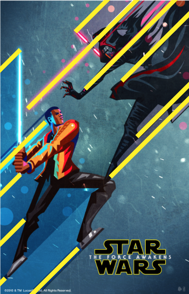
The illustration takes advantage of the design element of leading lines. Your eyes are naturally drawn to the image of Finn and Kylo Ren because of the use of leading lines. Not only are Finn and Kylo Ren drawn in a diagonal, action way, but the lines leading off behind them really emphasize that action. Movement, as shown above, really elevates the appearance of this poster.
Good Use of Value
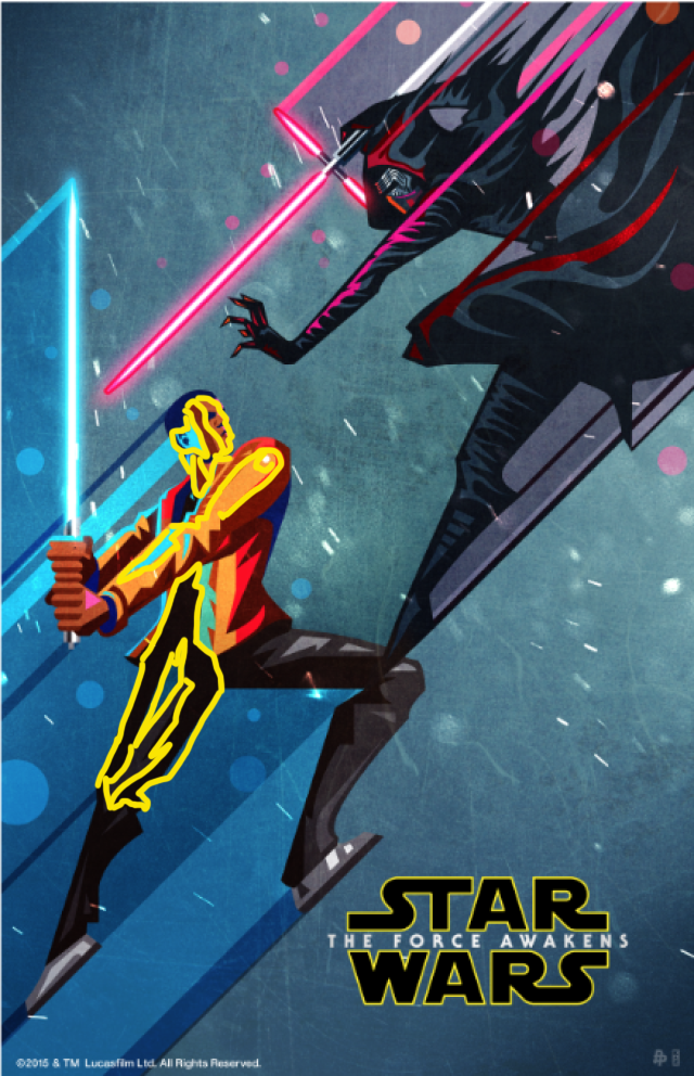
There is an excellent use of value to show dimension with the vector illustration in this poster. Through out the design there are examples of shadows on the two men, and also the different value shadows leading off of them. On the face alone there is several layers of different shades of color, some of them the same type of color scheme just lighter and darker, but the artist also takes advantage of the light saber color reflecting off his face as well. There is also dimension with the shading on his pants, and also on Kylo Ren’s clothing and mask as well.
Contrast
Contrast is prominent in this design in multiple ways. Firstly, the color scheme shows great use of contrast with the cool blue color with the hot red color. There’s also contrast with the vibrant red/pink color of Kylo’s light saber highlighting off of his dark black and grey costume. The contrast between the two characters is also noticeable here as well with Finn on the good side and Kylo Ren on the bad, so having those two perspectives is a fun play on contrast as well.
If you look at the other artwork in the series they all have these same elements with consistency and repetition between the different posters, and all of them show good use of good contrasting design principles.
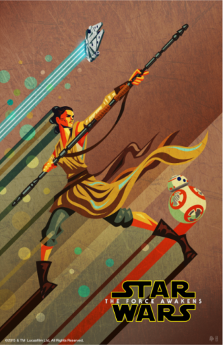
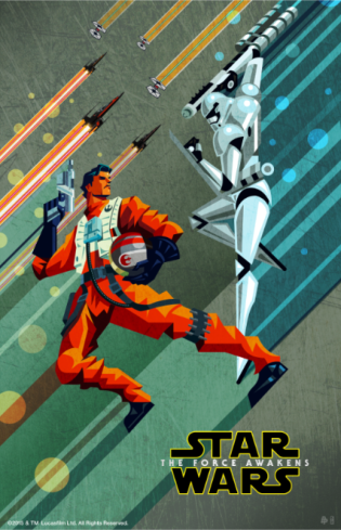
Having warm color verses cold colors, using a variety of shades and focusing on the value of the design, and also using diagonal action lines really helped elevate the look and appearance of these vector illustrations. I am definitely a fan.
